
Buy the dip. Buy the dip. Buy the dip.
This overwhelming, dominating mantra is the one reason why the S&P 500 Index’s ($SPX) long-term chart looks like this:
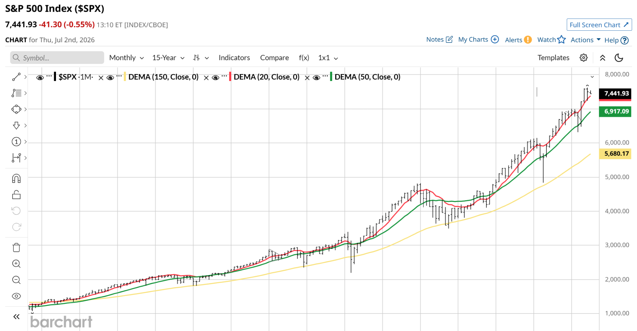
You don’t get a move from $1,000 to $7,500 over 15 years on fundamentals, valuation, and tech innovation alone. You need a massive injection of liquidity by central banks, and an undying belief that when the market is down in price, you buy and don’t ever sell. If the market dives again, you buy more.
Based on my experience managing money since 1993, whenever I see things getting too giddy, too easy, and frankly too arrogant for my tastes, I think back to this.
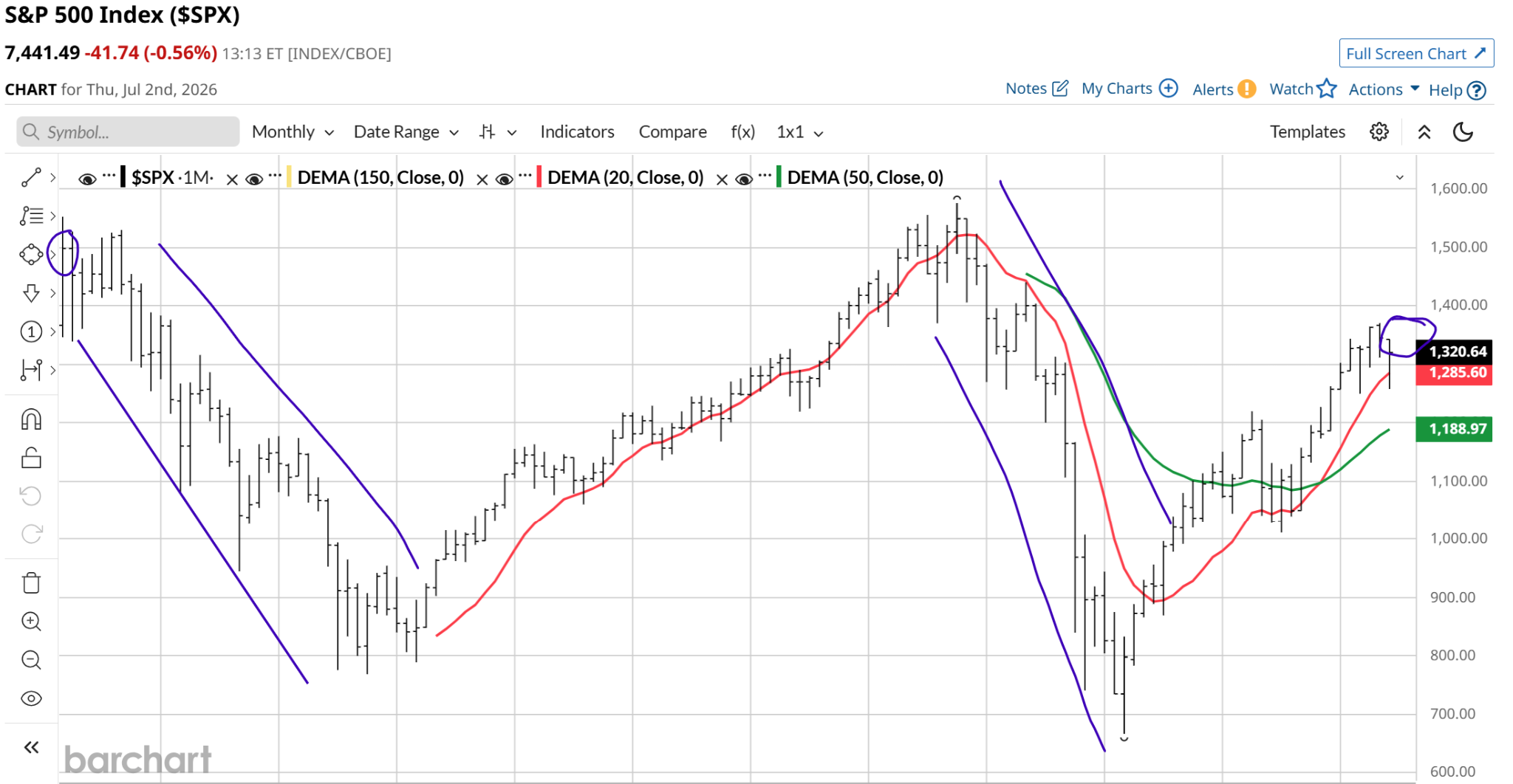
The first chart above was the past 15-year period for the S&P 500 Index. This second chart is the 11.5-year period that preceded it. Specifically, March 1, 2000 through June 30, 2011.
I drew in purple the failure of the “buy the dip” mentality. Two failures over this period, both of historic fashion. A “twin-killing” scenario, in which the dot-com bubble and global financial crisis teamed up to produce a 25% loss in the S&P 500 over this period.
That’s why I’m so worried these days. Gains in the broad market have masked the underlying weakness in the stocks that dominate it. This weakness is just the sort that could take us back to 2000-2011.
I’ve written extensively here about how one-third of S&P 500 stocks have multi-year negative returns, and how roughly one-half of them have failed to beat T-bill returns since the start of 2022. So while “SPY and chill” has been a splendid approach, history warns us not to be complacent.
Big Dippers, Unite?
To that end, a new piece of historical data is making its way through the financial press, tempting everyday investors and traders to buy every minor dip. The bullish thesis, published by Bluekurtic Market Insights, focuses on a specific milestone: the index printing 20 or more all-time highs in the first six months of the year. Including 2026, which had 24 all-time highs, this phenomenon has occurred just 16 times since 1955.
The cheerleaders are pointing to a flawless track record. In all 15 previous instances, the index finished the full year in positive territory — a 100% win rate, with an average full-year return of just over 20%. Furthermore, they note the index has never peaked before August in these scenarios, creating a seemingly perfect statistical tailwind for dip-buyers stepping in right now.
It sounds ironclad. But as a tactical risk manager who leans into a strict capital preservation mindset, my daily chart work reveals that relying on backward-looking macroeconomic averages right now is as likely a trap as anything else.
The problem with generic, 70-year historical win rates is that they treat the index as a single, uniform entity. They completely ignore a major, unique issue of our times when it comes to investing in the S&P 500. How the index is constructed today versus how it looked decades ago.
The historical data from 1955, 1980, or even the 1990s occurred in a balanced, diversified market. Today, the cap-weighted S&P 500 is intensely top-heavy. The index can print a nominal “all-time high” simply because two or three mega-cap tech giants are being heavily front-run by passive inflows, even while the rest of the market is quietly fracturing underneath.
If you pull back the curtain and look at the actual data across the S&P 100, a massive number of former market leaders are already in a localized bear market. In addition, past breakout years did not launch from a Shiller CAPE ratio sitting at 41x, the 98th percentile of historical overvaluation.
Momentum can carry an expensive market further than expected, but it leaves an incredibly thin margin for error when the underlying liquidity begins to dry up.
The statistical argument claims that because the market historically has never peaked before August in these breakout years, July represents a safe sandbox for dip buyers. But last I checked, isn’t July part of “sell in May and go away,” the old adage that runs through November?
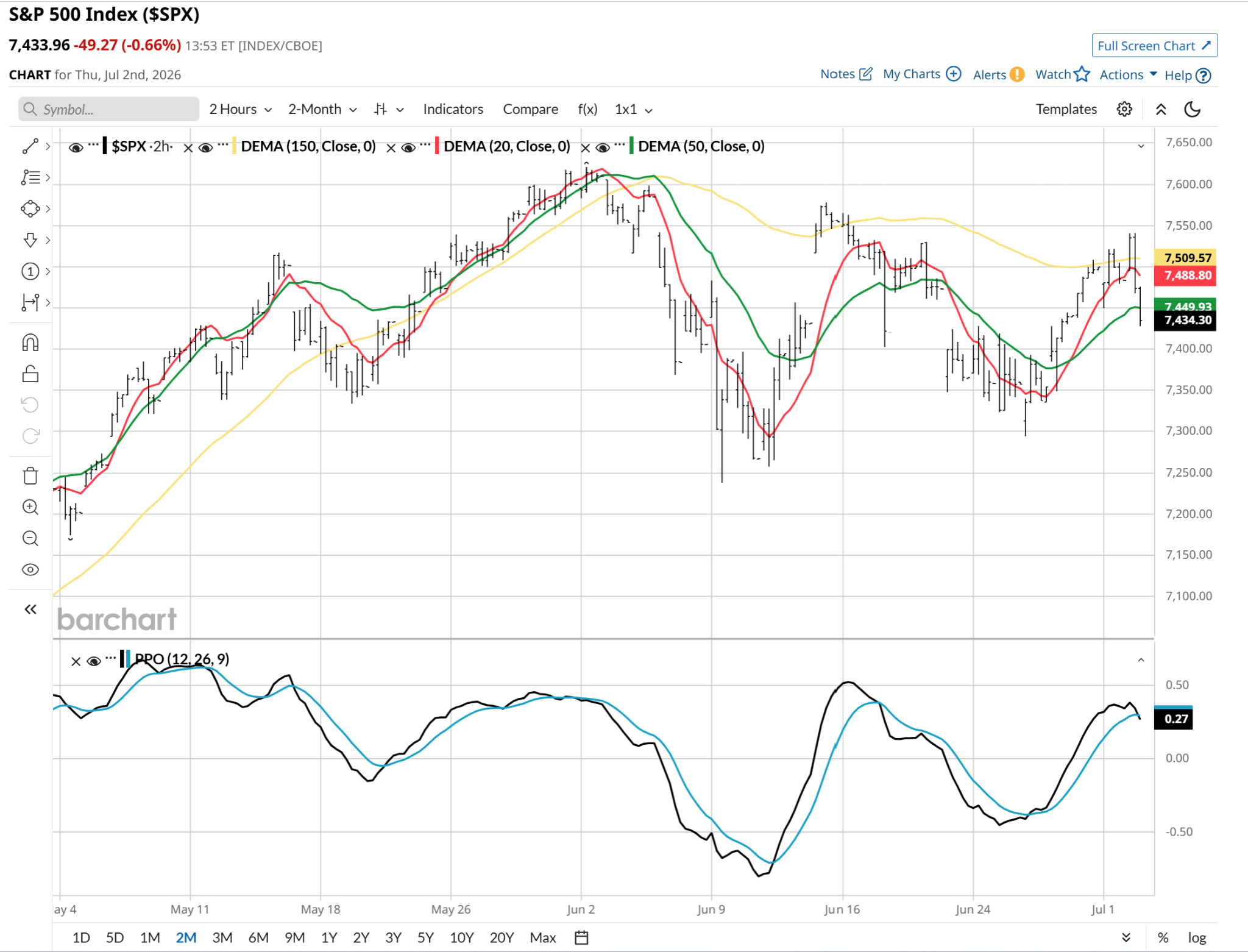
Since we’re talking primarily about the month of July here, I dropped in on the S&P 500’s current state, using a chart of 2-hour prices. What do I see? A near-term “sell the rip,” by way of the percentage price oscillator (PPO) having just crossed down (black line through blue line) as I’m writing this mid-day Thursday.
But remember how fast market gravity operates: the stock market takes the stairs up, and the elevator down. Relying on a calendar-based statistic to time your risk exposure is a dangerous compromise. And that could lead to a scenario where buying the dip again reverts to a strategy that leaves investors resting in peace (RIP).
Rob Isbitts is a semi-retired CIO, former fiduciary investment advisor, and Barchart.com columnist. He runs ETFYourself.com (featuring the Fresh Charts weekly post), and ROAR.PiTrade.com, helping investors to better-manage their own portfolios.
On the date of publication, Rob Isbitts did not have (either directly or indirectly) positions in any of the securities mentioned in this article. All information and data in this article is solely for informational purposes. For more information please view the Barchart Disclosure Policy here.


/A%20photo%20of%20a%20Sandisk%20Solid%20State%20Drive%20by%20Top%20Popular%20Vector%20by%20Shutterstock.jpg)
/AI%20(artificial%20intelligence)/Data%20Center%20by%20Caureem%20via%20Shutterstock%20(2).jpg)
