
As you might have read in some of my past articles, when it comes to Barchart, I was a “long time listener, first time caller.” When I started writing here early last year, it was a case of “long time user, first time writer.”
Hundreds of articles later, I am still closer to the tip of the iceberg than the bottom of the ocean when it comes to scouting out ways to sharpen my investing skills. And thanks to Barchart, I have no shortage of new things to learn.
One feature within the Barchart Stock Screener tool that resonated with me is a pre-built filter known as the J-Pattern or J-Curve. I’ve kept my use of it mostly to myself, as it often opts for momentum stocks.
I like momentum just like the next trader, but at the margin. I’m more of what I’d call a “contrarian chartist.” That is, when I see a pattern I’ve seen literally millions of times over the decades, I simply say to myself “aha, that’s one I’ll focus on.”
More recently, the J-Pattern screener has been producing both a mix of stocks already well into powerful moves which look to continue, and others which look to be in the early to middle innings of their moves. I quickly glanced at this list each day during my two recent stints filling in for Barchart’s Chart of the Day maestro, Jim Van Meerten.
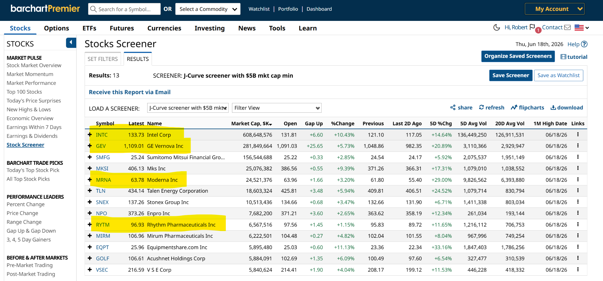
As Jim returns to make us a little bit smarter each day, the current iteration of the J-Pattern screen (as of Thursday’s market close) caught my eye. Why? I found a quartet of intriguing charts.
Here’s my full version of the screen, which is the standard one you can pull up under Barchart Screeners, alongside many others. All I do with my custom version of it is to put a $5 billion market cap restriction on it, to avoid stocks whose charts might be based on more scattered trading activity.
What Is the J-Pattern Screen?
This describes a chart which has gone through the following steps recently:
- An initial period of underperformance, correction, or sideways consolidation
- Followed by a sudden, sharp, and accelerating upward breakout.
The resulting price path traces the distinct shape of the letter “J.” Barchart’s J-Pattern screener aims to identify these inflection points in real time. I’ve devoted some time to this chart pattern, but I’m going to be doing more of that.
I think in a market now dominated by traders more than investors, and with technical analysis now a critical element in market price movement, there are two ways to win. A stock can carve out a winning pattern like the J on its own. Or it can start moving toward that formation, only to have bullish traders who understand that established pattern pile on, creating a self-fulfilling prophecy of momentum.
Which Stocks with the J-Pattern Look Best Right Now?
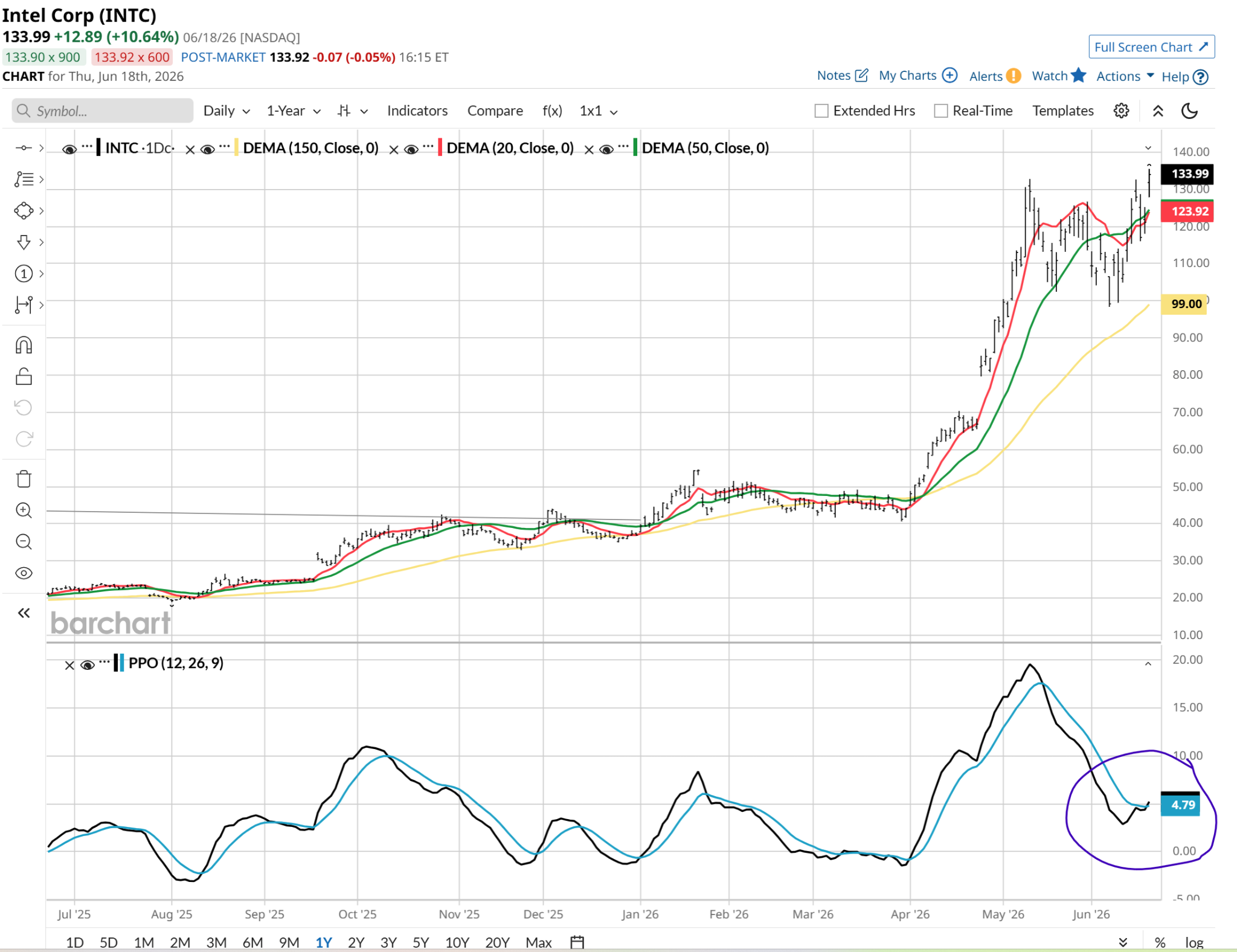
Intel (INTC): The semiconductor heavyweight is showing intense signs of life as capital rotates back into hardware. That’s a gorgeous PPO indicator right there. I’ll try to force myself not to look at how much the stock is up already! This is one that might be more of a collar or-out-of-the money call option purchase for a risk manager like me.
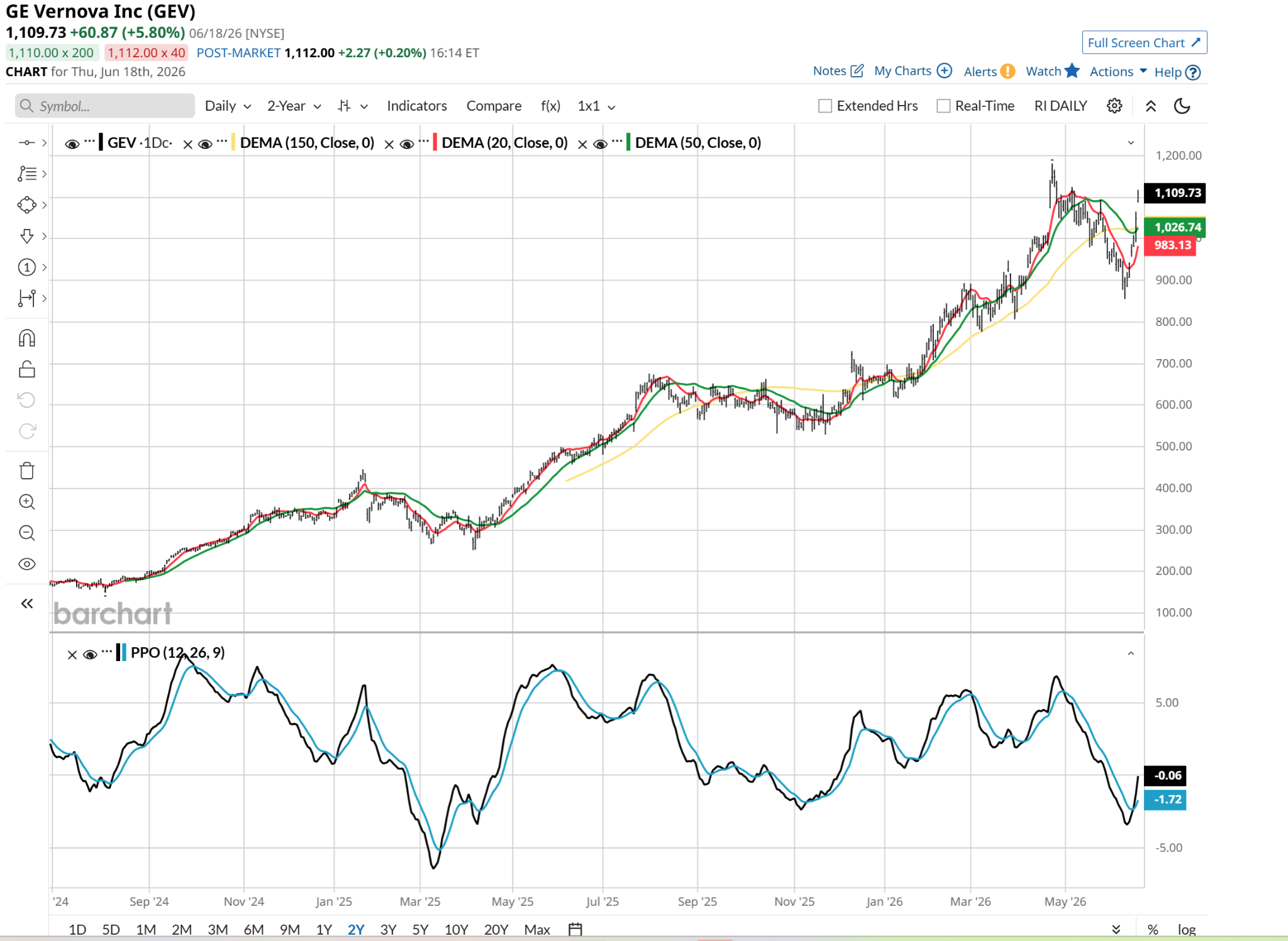
GE Vernova (GEV): A major player in the global energy transition, GEV is in the process of a textbook high-momentum vertical move. It is too far gone for my conservative preferences, but that doesn’t mean it can’t rocket higher from here.
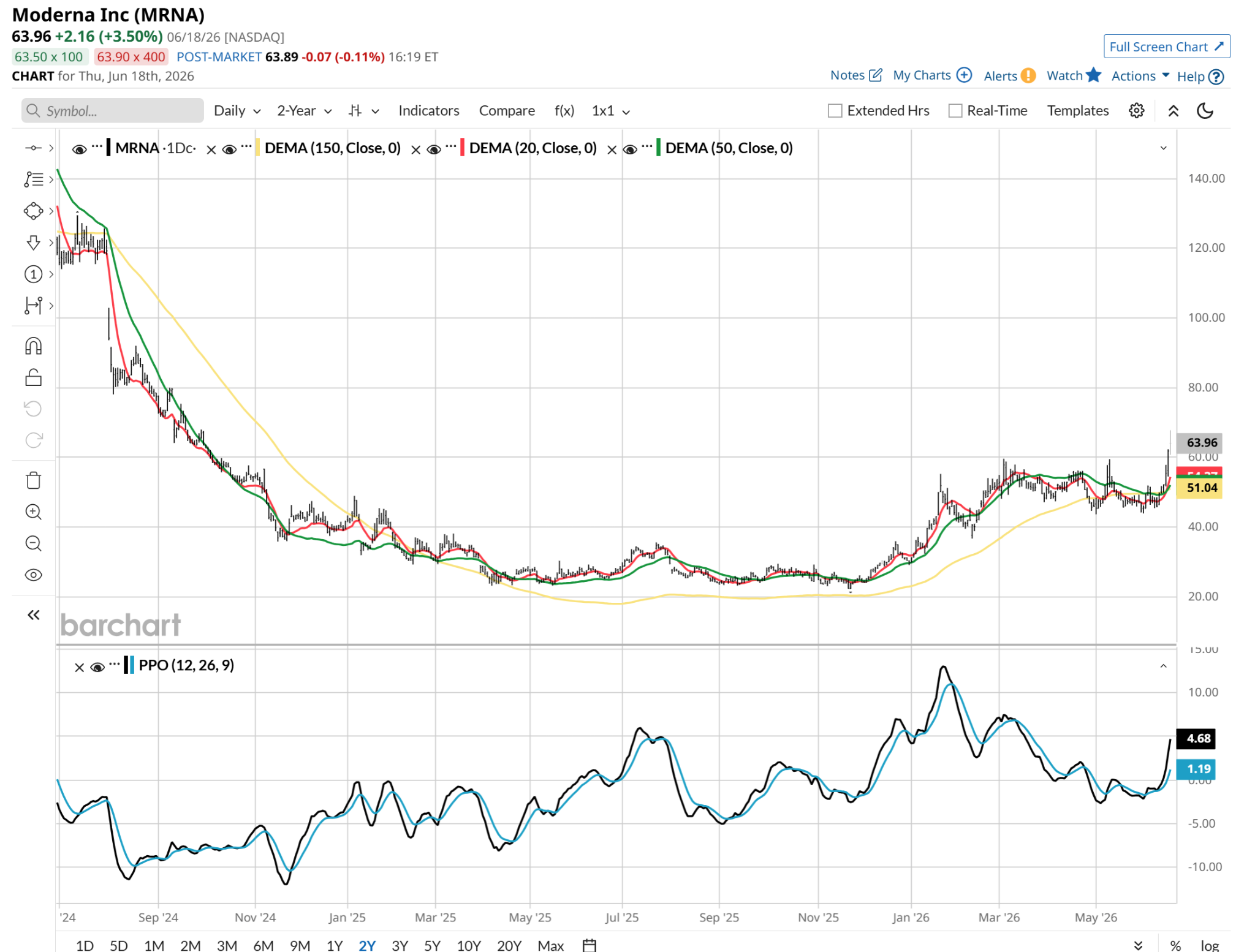
Moderna (MRNA): The biotechnology pioneer makes my short list, as it has snapped out of its previous basing formation to trigger the vertical side of the J-curve. This is my favorite of the bunch, only because it has so much overhead room to run after being nothing but a money-killer the past two years.
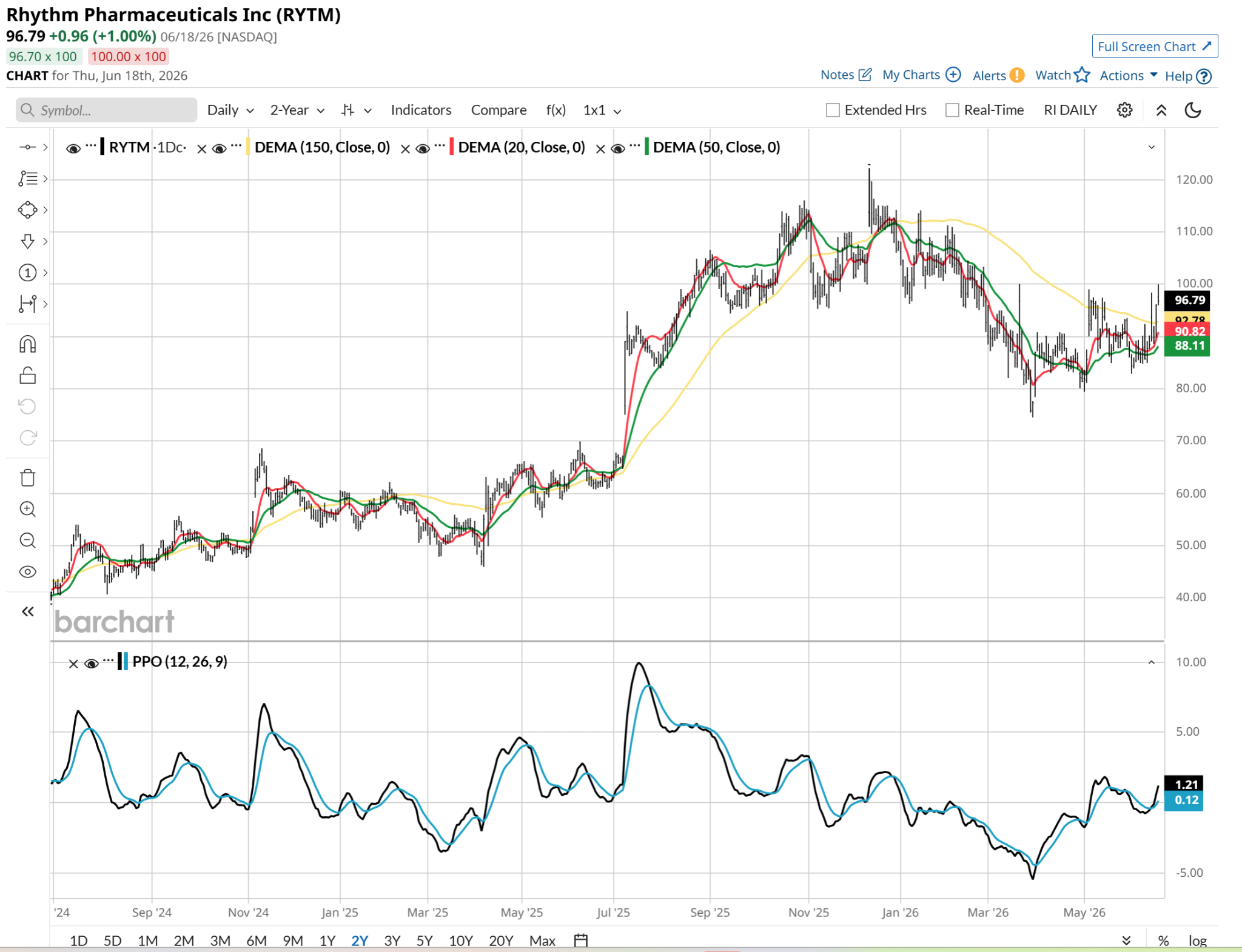
Rhythm Pharmaceuticals (RYTM): Positioned at the lighter end of the scale with a $6.5 billion market cap, this biopharmaceutical firm is flashing steady accumulation. From a pure chart standpoint, this is the best one to me. The market cap is on the low end of what I normally scout for, but that’s changing due to the overrated nature of so many S&P 500 ($SPX) large-cap stocks. We should also not ignore the fact that two pharma stocks made my top four here. That industry is showing signs of breakout upside while most market segments are not.
J Is for Jumping Stock Prices!
The J-curve screen is an excellent step within a broader process of identifying where immediate, high-velocity capital flows are moving below the surface of the broad index. However, because the vertical leg of a J-curve is inherently fast-moving, chasing these names without a strict risk management framework can expose your capital to sharp, mean-reverting pullbacks. My bottom line: let the screen locate the potential winners, while your process controls the risk.
Rob Isbitts created the ROAR Score, based on his 40+ years of technical analysis experience. ROAR helps DIY investors manage risk and create their own portfolios. For Rob’s written research, check out ETFYourself.com.
On the date of publication, Rob Isbitts did not have (either directly or indirectly) positions in any of the securities mentioned in this article. All information and data in this article is solely for informational purposes. For more information please view the Barchart Disclosure Policy here.

/Microsoft%20sign%20at%20the%20headquarters%20by%20VDB%20Photos%20via%20Shutterstock.jpg)


/Space/Cargo%20spacecraft%20in%20low-Earth%20orbit%20by%20Paopano%20via%20Shutterstock.jpg)