
Futures and stocks have many differences, especially when it comes to charting.
Stock charts are perpetual with no interruptions in price action. They make historical price research reliable and consistent. Charts can go back for many years or decades, depending on how long the company has been publicly traded.
Futures charts, however, are entirely different. The biggest issue for charting futures is that every futures contract traded will expire at some point. Futures contracts have multiple contract months trading simultaneously. It's up to you, the trader, to find the contract month with the most volume traded, making it the front-month contract. At some point, this front-month contract will expire and force all speculators out of that contract month, or else face taking physical delivery of the commodity. Since speculators wish to continue trading, they don't just stop because a contract expires; they start the process of finding a new front-month contract. Once the new front month contract is identified, traders will then trade that contract until it too expires.
All commodities have specific months of the year for being produced, processed/refined. We will use the corn market as an example for our article.
Each futures contract specification will list the individual months available for trading. For example, corn has five months available for trading each year. They are March, May, July, September, and December. If you notice, the months available are generally related to corn's planting and harvest seasons. Commercial traders need these months available for hedging their price risk of producing or processing corn throughout the year.
Reasons for varying cash needs throughout the year
Commercial corn producers have different operations to run during the planting season than during the harvest season. Meaning there is a different cost involved with both seasons. Other costs mean cash corn has to be priced accordingly for that season. If cash prices are different, then futures prices must be different.
During the planting season, a producer will have to plow the earth, purchase seeds and possibly other nutrients (nitrogen), plant those seeds and apply the other nutrients, and keep the crops hydrated with irrigation equipment and other processes to ensure a successful planting.
Producers will need additional equipment during the harvest, such as a corn harvester and multiple trailers, to transport the corn from the field to the grain dryers. There are also rental or maintenance fees for a grain dryer to store the corn, propane for drying the corn, transportation fees for hauling the corn from the farm to the grain elevator, and many other processes.
How do we traders see these different prices?
The answer is to chart the contract-specific symbol for the futures market you are trading. The current front-month contract should sync with a commodity's different production and processing seasons. These futures charts are popular and are the most accurate.
Generally, contract-specific charts have limitations on how far back the data is helpful because until the contract is the front month, the volume is meager and could distort the chart candles.
At times we traders may need a longer-term view of the commodity than the contract-specific chart shows us. To resolve this issue, futures charting software created continuous charts. They are also known as a near-month continuous chart. They give the appearance that the contracts never expire. As one front-month contract expires, the charting package automatically begins placing the new front-month contract on the same chart and, in a way, splicing together each new front-month contract.
Near-month continuous charts may look nice because all the candles are from front-month (high volume) contracts. But, because of how they are constructed, you may be viewing historical data from a planting season during the actual harvest season. For example, you may be looking for a resistance area to sell. Looking to the left on your near-month continuous chart is an excellent area to sell. But, is it? Depending on how far back in time this area was created, you may look at data created on the chart during the planting season. Remember, planting and harvest seasons have different costs for producers.
An alternative style continuous chart to use
A more accurate continuous chart is a contract-specific continuous chart. Instead of splicing together each new front-month contract, this continuous chart splices together only the specific contract month you want to see. So, if the current front month is December, then all past data spliced onto the chart is from prior December contracts. These charts now compare December prices to previous December prices, making your longer-term analysis apples to apple comparison. The same chart type can be created when July is the front month for the planting season; all previously spliced data was from July contracts.
Would you like to see charts where I can show you the variations in the July and December prices?
We will also examine a near-month continuous chart and see how different each contract month is.
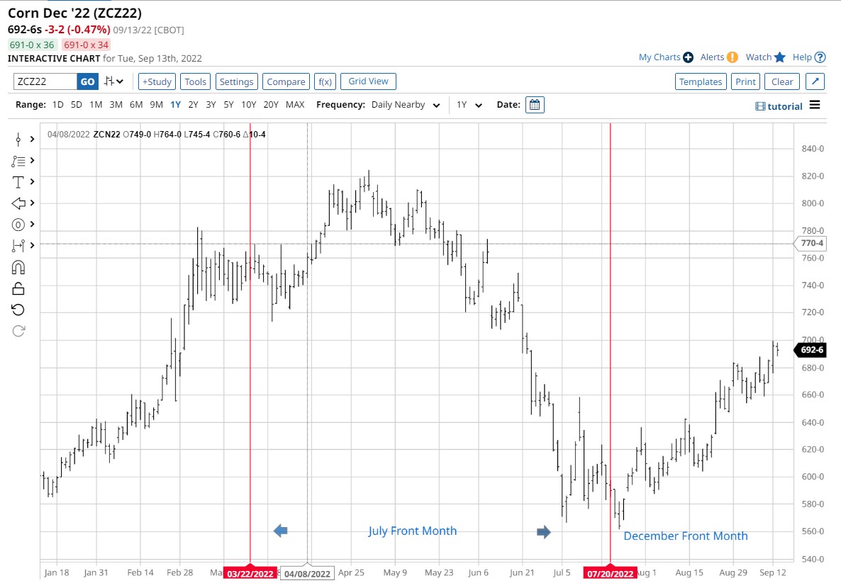
Here is a corn near-month continuous chart from Barchart.com. The area between the red lines indicates July contract prices. To the left are May contract prices, and to the right are December contract prices. As a trader, you may look for a place to sell on this chart. However, the market prices to the left that you might consider for selling were created when July was the front month. Currently, the December corn price is rallying just before the harvest season. The danger of using the July contract prices is that they are irrelevant to the December corn market.
Let's look at a couple of contract-specific charts so you may see the discrepancies between the prices of each month, which should validate my comments about this near-month continuous chart.
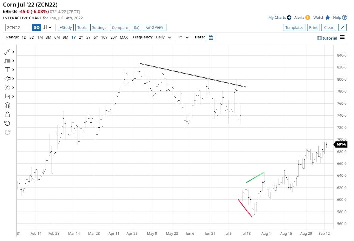
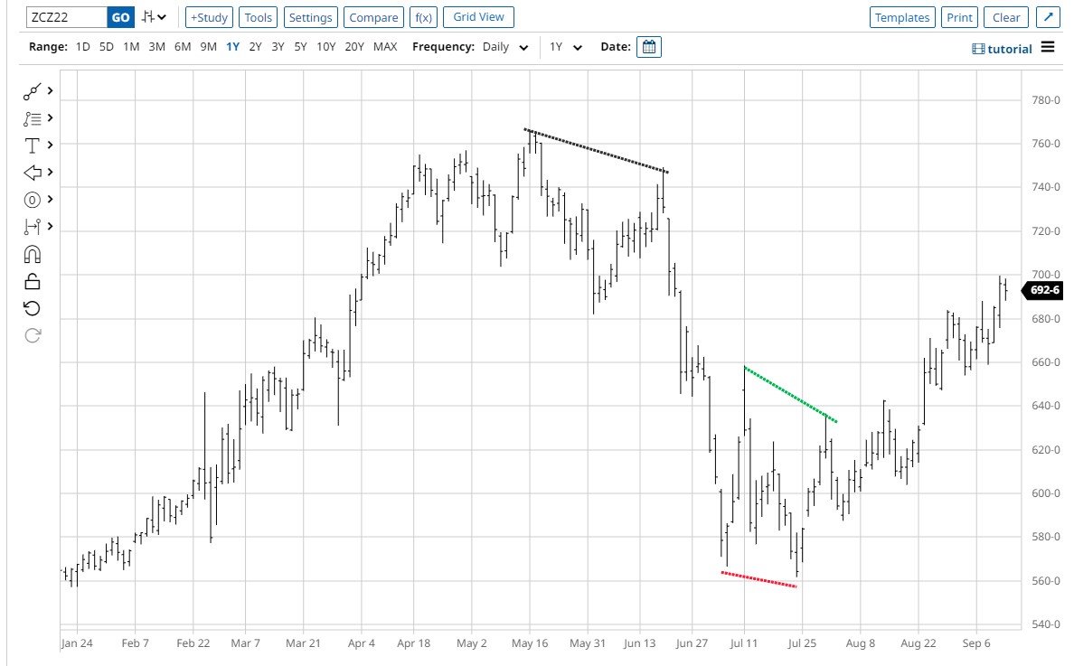
Both of these are the corn contract-specific continuous charts. The upper one is July (planting season), and the lower one is December (harvest season). To illustrate how different the prices and patterns for each contract month are, I used color-coded lines.
Also, notice that the high made in May for the July contract was about 8.20 per bushel. At the same time, the high created in the December contract was 7.60. Now imagine how different the prices could be if you used the near-month continuous chart to find resistance for the current rally in the December contract.
Another helpful analysis using contract-specific continuous charts compares this year's price to last year's same contract month's highs and lows. If we are trading above the previous year's high, that could be perceived as bullish, and a robust fundamental change has occurred to make this happen. The same would be true if this year's prices were trading under last year's same contract months low, except it would be perceived to be bearish.
How to create a contract-specific continuous chart on Barchart
- Open a futures chart of the current front month.
- Click on "Settings."
- A sub-menu will open; click on "Futures."
- Check the box next to "Build Continuation Chart."
- Click "Apply."
The futures markets have so many types of charts to use. In my opinion, the contract-specific chart is the king. If I need a longer-term view of the market I'm trading; I will use the contract-specific continuous chart. Using the same chart style consistently is key to getting accurate information for your trading decisions.
More Education News from Barchart

/Delta%20Air%20Lines%2C%20Inc_%20passanger%20plane-by%20viper-zero%20via%20iStock.jpg)
/A%20close-up%20of%20a%20General%20Motors%20corporate%20sign%20by%20lindaparton%20via%20Adobe%20Stock.jpeg)