Friday was NOT a good day for the markets. Tariffs take some of the blame. Plus, behind-the-scenes signs of weakness and worry were evident even before stocks tumbled (I spent last week highlighting them).
But the BIGGEST problem was one shocking element of the July jobs report. Let me explain…
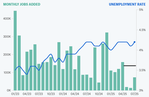
The MoneyShow Chart of the Day here shows job creation in green, and the unemployment rate in blue. You can see that the former has been gradually trending lower, while the latter has been gradually trending higher. Wall Street has been okay with that because A) The job market was too hot previously, raising inflation concerns and B) Cooling would allow the Federal Reserve to eventually start lowering interest rates again.
MASSIVE Jobs Revisions Raise Labor Market Concerns
Source: Yahoo Finance
But it’s the black line that matters most. That shows roughly where the Labor Department had PREVIOUSLY reported May and June job creation – 144,000 and 147,000, respectively.
In Friday’s report, the government were slashed those readings to just 19,000 and 14,000. And of course, July’s tally of 73,000 badly missed the average forecast of 110,000. The data always gets tweaked to a degree, but this was shocking.
As a result, interest rates plunged…gold shot higher…and of course, stocks got hammered. So, I’ll just repeat the advice I gave before the numbers came out last week: Take some profits, lighten up, and prepare for more market volatility in these seasonally challenging months.
If you want to get more articles and chart analysis from MoneyShow like this, subscribe to our Top Pros’ Top Picks newsletter here.
/NVIDIA%20Corp%20logo%20on%20phone-by%20Evolf%20via%20Shutterstock.jpg)

/Jen-Hsun%20Huan%20NVIDIA's%20Founder%2C%20President%20and%20CEO%20by%20jamesonwu1972%20via%20Shutterstock.jpg)
/Broadcom%20Inc%20logo%20on%20building-by%20Poetra_%20RH%20via%20Shutterstock.jpg)