This is sponsored content. Barchart is not endorsing the websites or products set forth below.
Most traders stick to one chart type—but that’s often a mistake. Choosing the right chart for your strategy can be the difference between spotting a clean breakout or missing a trend entirely. Many fail to adapt because they don’t realize how much each chart type can change the clarity of their signals.
For example, candlestick charts dominate because they show momentum shifts clearly, but range bar charts often give faster entries in volatile markets. A recent trading study by CME Group found that traders using non-time-based charts improved their entry timing by up to 17%. Knowing which chart to use isn’t optional—it’s strategic.
Below, you can explore the best chart types for trading and other chart types can be found on WR Trading that's just one click away.
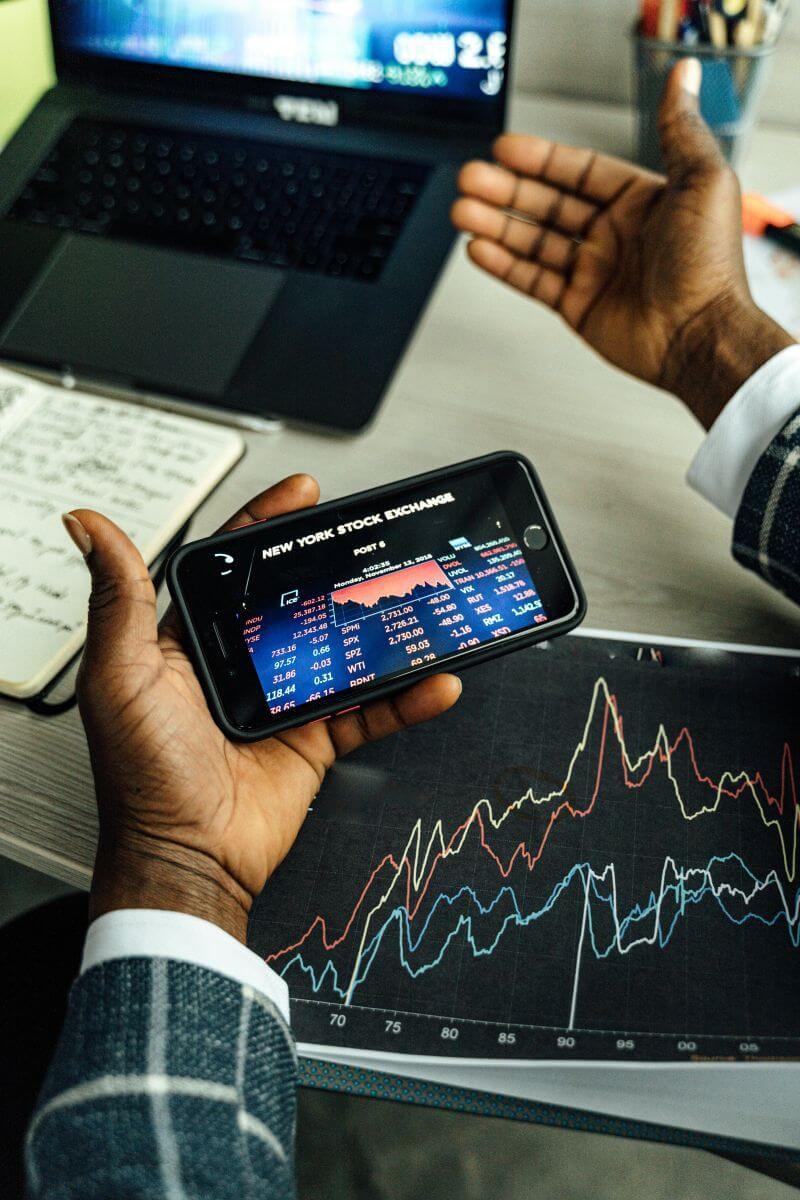
Candlestick Charts: The Most Popular for a Reason
Candlestick charts are the go-to for most traders. They show four data points per candle: open, high, low and close. This gives more context than a simple line chart.
The real edge lies in reading candlestick patterns. A bullish engulfing near support can signal reversal; a doji atop a trend may warn of fading momentum. These patterns reveal sentiment shifts early.
Scalpers and swing traders use them across timeframes—5-minute charts for entries, daily charts for trends. Their versatility keeps them the most popular chart type.
Bar Charts: Cleaner View, Same Data
Bar charts offer the same OHLC data as candlesticks but display them differently. Instead of filled bodies, bars are just vertical lines with small ticks for open and close.
Some traders prefer bar charts because they reduce visual noise. Without colored candles drawing attention, traders focus more on price structure. This cleaner view is helpful for long-term analysis.
For instance, in futures trading, many institutional traders favor bar charts for studying price action over several months. They look at patterns like inside bars or outside bars in context with volume. It's less about reading patterns and more about understanding price movement over time.
Line Charts: Best for Simplicity and Big Picture Trends
Line charts are made by connecting closing prices. That’s it. No highs, no lows, no open. Just the closing price.
Traders use line charts to zoom out and see the overall trend without distractions. This is useful when comparing what's moving different markets or scanning multiple assets quickly.
If you’re analyzing correlation between indices and currencies, a line chart helps you focus on general price direction without noise. For example, when comparing EUR/USD and the DXY (Dollar Index), line charts reveal inverse movement more clearly than candles or bars.
They’re not great for entries, but for spotting macro direction or divergence, they’re excellent.
Heikin Ashi Charts: Smoother Trends, Slower Reactions
Heikin Ashi charts average price moves to smooth trends, filtering out noise and reducing false signals in choppy markets.
For trend followers, they help you stay in trades longer—green candles suggest holding, red ones signal caution. While slower than standard candlesticks, they offer clearer trends and fewer whipsaws, ideal for smoother strategies.
Renko Charts: Price-Based and Clean Breakout Signals
Renko charts ignore time completely. They build new bricks only when price moves a set amount. That means you won’t get a new block until the asset moves, say, 10 pips or 50 cents, depending on your settings.
This is powerful for spotting breakouts. No time-based noise, just clear price movement.
Forex traders love Renko during news events. It cuts through the fast movement and highlights real directional shifts. If a breakout sticks, Renko shows it cleanly.
But Renko doesn’t show wicks or volatility. You miss intra-bar swings. It’s best for confirming trends or planning breakout entries, not reading candles for signals.
Range Bar Charts: Fast Entries, Clear Stops
Range bar charts are similar to Renko but more reactive. Each bar forms only when price moves a defined range. So, in volatile conditions, you get more bars. In slow periods, fewer.
This gives a dynamic view of market pace. Day traders use range bars to find early entries and exit points. You can set a 5-point range bar in the S&P 500 and track quick reversals without waiting on timed candles.
Because these charts are tied to price movement, they adjust automatically to market conditions. They help avoid getting stuck in slow zones and force you to act only when price does.
Tick Charts: For Those Who Watch Every Move
Tick charts form bars based on a set number of trades—not time, not price movement. For example, a 233-tick chart builds a new bar every 233 trades.
Scalpers use tick charts to read order flow in real time. They see where volume clusters, where traders get trapped and where the breakout pressure builds.
Futures and stock traders benefit most from tick charts because trade frequency is high. In slower forex pairs, tick charts can be inconsistent. But during major market sessions or announcements, tick charts give unmatched insight into momentum and execution timing.
Point and Figure Charts: Unique View for Serious Trend Traders
Point and Figure is another one of the chart types that remove time completely and focus only on price movement in one direction. Xs for up moves, Os for down.
They excel at filtering out noise and highlighting long-term trends. Many old-school traders still use Point and Figure for detecting support/resistance levels that aren't obvious on regular charts.
Breakouts and reversals are clear, but you won’t find volume or time data here. It's a niche chart, but it works well for stock traders with longer holding periods.
This article contains sponsored content. Barchart has not reviewed, approved, or endorsed the content, and may receive compensation for placement of the content on this site. For more information please view the Barchart Disclosure Policy here.
/Micron%20Technology%20Inc_billboard-by%20Poetra_RH%20via%20Shutterstock.jpg)
/Palantir%20(PLTR)%20by%20Piotr%20Swat%20via%20Shutterstock.jpg)

/NVIDIA%20Corp%20logo%20on%20phone%20and%20AI%20chip-by%20Below%20the%20Sky%20via%20Shutterstock.jpg)