As I’ve mentioned here before, I am really leaning in to the idea that many exchange-traded funds (ETFs), while they are well-run vehicles, tend to mimic each other’s performance too closely. This is a macro market issue, not an ETF-specific one. But it challenges investors and traders to really know not only what they own, but whether it is responsible for its own movement.
Here’s what I mean. The financial sector is currently a house divided, with investors caught between a specific industry-driven narrative and the powerful gravitational pull of the interest rate cycle. While the Financial Select Sector SPDR (XLF) has lagged the broader market this year, a potential rally is brewing.
However, if that rally comes through, I believe it will have much less to do with earnings, company quality, or revenue and cash flow multiples of individual stocks. Instead, it will be a standard Wall Street knee-jerk reaction to interest rates falling, reversing the inflation fear-driven spike during March.
A Closer Look at Financial ETFs
Financial stocks, along with other sectors like real estate investment trusts (REITs), and rate-sensitive industries like housing and construction, are acting like market monkeys. They are not just rate sensitive; they are rate aligned. Their success now depends more on the macro issue, the yield curve, than it does on bank balance sheets.
Let’s chart a few of them to see what I mean. XLF is first.
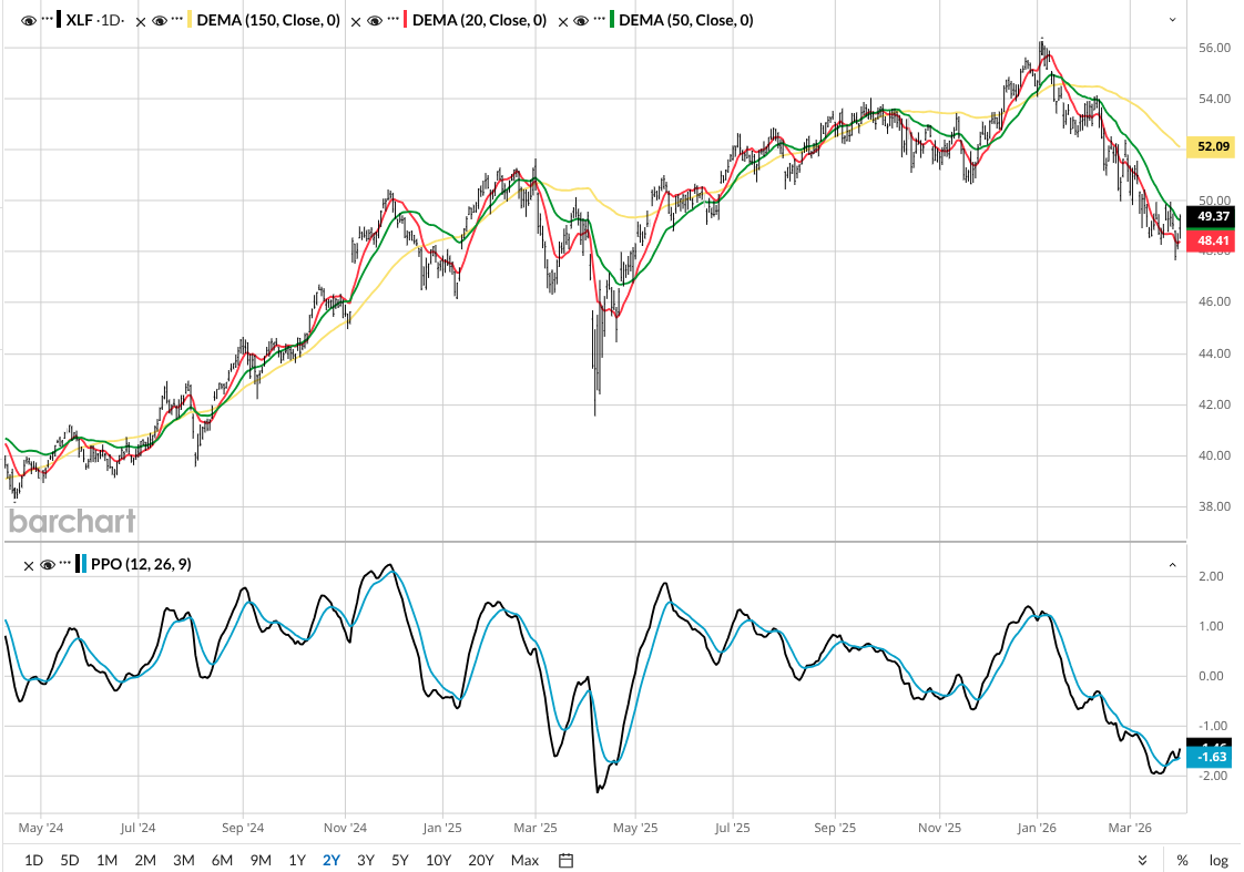
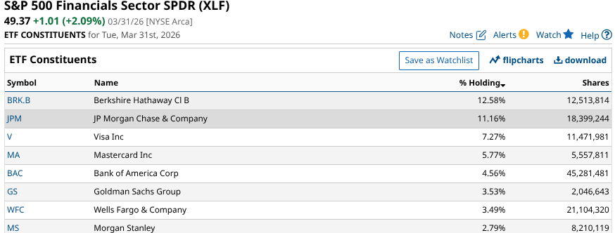
This ETF owns 80 stocks, but these eight account for just over half of assets under management.
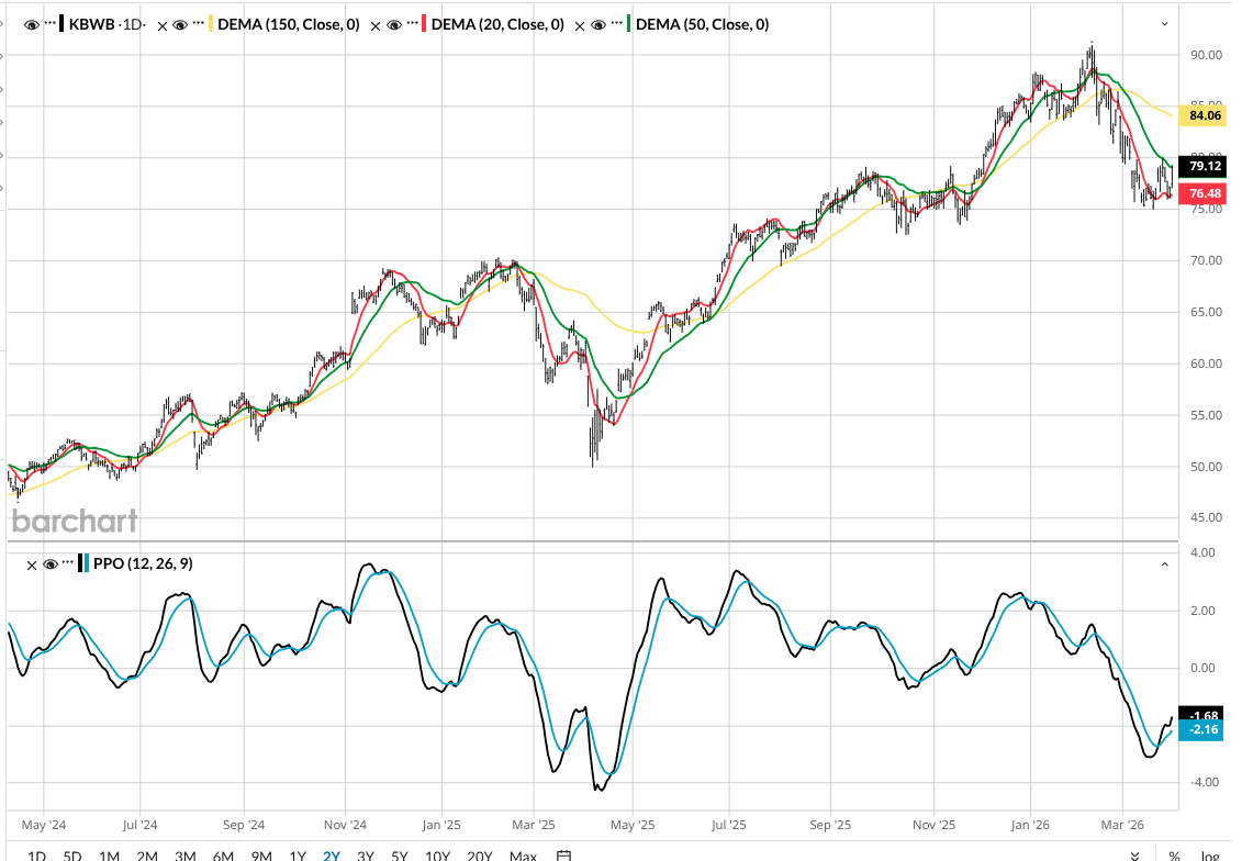
Next up is the Invesco KBW Bank ETF (KBWB). It owns the large-cap bank stocks. It's also trying to rally, as you can see from this similar chart.
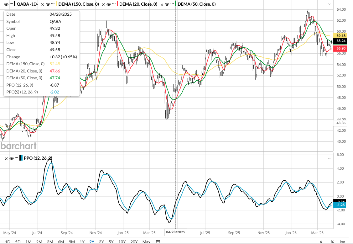
And here is the Nasdaq Aba Community Bank Index Fund FT (QABA), which owns community banks. Now, there was a time when an industry like this would look very different from its sector peers above. But to me, this chart is 90% to 95% identical to the others. That’s despite a much different array of banks and a much smaller market capitalization.
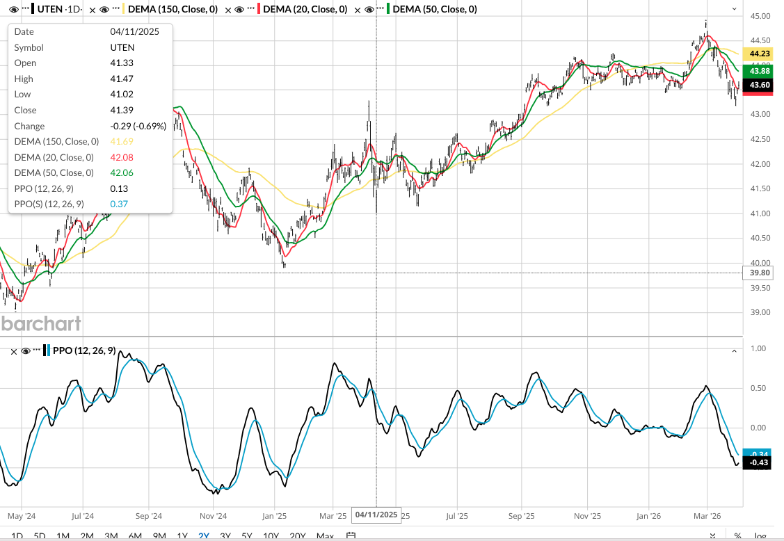
This chart below explains it all. It is the U.S. Treasury 10 Year Note ETF (UTEN), which tracks the price of the 10-year U.S. Treasury bond. If we focus on the right side of this chart, and compare it to the three above, guess what? It's hard to tell them apart. That’s my point. Financial stocks might be preparing to rally, but they are simply following the bond market.
The Bottom Line
Whether it is sentiment toward lower inflation as the Iran war potentially subsides, optimism about a Fed rate cut being back on the table, recession or stagflation fears, or something else, it does not matter. It is all one trade right now.
And that means as investors, we need to spend more time on macro impacts on markets, and de-emphasize stock and industry-related analysis. For how long? I don’t know. But I do not rule out this being a systemic change that doesn’t change back.
That, in turn, cries out for greater understanding of ETFs. Not just what they are, but how they work. Because while many sound different, if their prices move together, up and down, that's really what impacts our invested capital.
Rob Isbitts created the ROAR Score, based on his 40+ years of technical analysis experience. ROAR helps DIY investors manage risk and create their own portfolios. For Rob's written research, check out ETFYourself.com.
On the date of publication, Rob Isbitts did not have (either directly or indirectly) positions in any of the securities mentioned in this article. All information and data in this article is solely for informational purposes. For more information please view the Barchart Disclosure Policy here.
/Micron%20Technology%20Inc_%20logo%20on%20building-by%20vzphotos%20vis%20iStock.jpg)
/AI%20(artificial%20intelligence)/AI%20engineer%20working%20on%20laptop%20by%20ART%20STOCK%20CREATIVE%20via%20Shutterstock.jpg)

/A%20corporate%20office%20for%20IBM%20by%20HJBC%20via%20Adobe%20Stock.jpeg)