Sometimes the markets are complicated. Other times, they’re simple. Today, I’m going to share the one chart that explains why “everything” tanked on Friday.
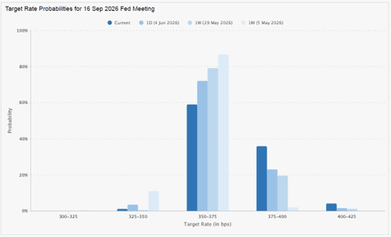
Here’s my MoneyShow Chart of the Day. It shows what interest rate futures markets have been pricing in for the likely level of the federal funds rate as of the Federal Reserve’s September meeting.
(To get more articles and podcasts from MoneyShow, subscribe to our Top Pros’ Top Picks newsletter here.)
Markets Aren’t Sure the Fed Will Stand Pat in September Any More!
Source: CME FedWatch
The lightest blue bar in the middle? It shows the probability – as of a month ago – that rates would stay at the CURRENT 3.5%-3.75% range when the Fed wraps its meeting up on Sept. 16. You can see markets assigned that outcome a 86.6% chance in early May.
The darkest blue bar to its left? That shows the probability as of Friday. It was down to 58.9%.
In other words, the much stronger-than-expected May jobs data shook things up big-time. After creeping up for several days, the chance of an actual Fed HIKE spiked at the end of last week.
If there’s one thing Wall Street hates, it’s when money gets more expensive! Growth stocks typically get hit particularly hard in a rising-rate scenario. So, it’s no surprise the nascent rotation out of growth and tech stocks (which I covered in my video Market Minute that morning) really accelerated to close out last week.
In other markets, the Treasury yield curve flattened notably, the US dollar ripped higher, and gold and silver plunged. That’s a textbook reaction to expectations of tighter Fed policy.
Don’t ignore it. Adapt. If you’re radically overweight tech, now is the time to get more exposure to other sectors. It’s what I’ve been preaching at recent MoneyShow events, and I still think it’s a good plan today!