Watch these tutorials:
Interactive Charts provide the most advanced and flexible platform for analyzing historical data, with over 140 customizable studies, drawing tools, custom spreads and expressions, plus a wide range of visualization tools.
While logged into the site, you will see continuous streaming updates to the chart. The chart uses data delayed according to exchange rules.
Note: The Chart Settings "cog" icon (located at the top right of the chart) can be opened to view all the settings for the chart, including those for the symbol, indicators added, and annotations / tools.

Real-Time Data
Most U.S. equities can be configured to show real-time Cboe BZX prices on the chart. All other asset classes including futures are delayed, per exchange rules.
The Cboe BZX Exchange currently accounts for approximately 11-12% of all U.S. equity trading each day. As a result, the real-time prices and volume displayed may have discrepancies when comparing the information with other sites offering real-time data, or with brokerage firms. Real-time prices are available only from 8:30am ET to 4pm ET and are not available with extended hour sessions (pre- and post-market).
If you require comprehensive real-time bids/asks/quotes, or are looking for real-time futures data, we offer a no-risk trial to one of our real-time products.
You may toggle the Real-Time setting on and off using the control at the top right side of the chart, or by opening the Chart Settings "cog" icon (top right of the chart) to access the Chart Settings. Once there, go to the "Data" section and check the "Real-Time" check box.
Hotkeys
These hotkeys are available, providing a shortcut to performing frequently-used actions:
, (comma) - opens the Chart Settings dialog
. (period) - opens the Templates dialog
/ (slash) - opens the Annotations (Tools) dialog
; (semi-colon) - opens the Indicators dialog
Default Chart Settings
If you are not logged into the site, or have not set up a default Chart Template, the default chart presented is a 6-Month Daily chart using OHLC bars.
If you are logged in (recommended for the BEST viewing experience), we save your chart settings for the next time you view a chart.
Auto-Chart Saving
Interactive Charts were designed to remember and retain your personalized settings when you are logged into the site. Any tool added to a chart is always saved and will be displayed next time you access that specific chart.
There are three auto-saving mechanisms available, defined in your Site Preferences page in the Tools tab.
- Use Last-Viewed Chart Settings: Any changes you make to a chart (aggregation, bar type, studies, etc.) are remembered and carried forward to the next chart you view. This is the recommended setting for a continuous chart viewing experience.
- Use Chart Template: This option should be used when you always want to use a specific template every time you view charts. When chosen, you must identify one of your custom chart templates to apply. While you can change the style of a chart when you're viewing it, the chart will always reset to this default template next time you open the chart.
- Save Every Chart: Every chart is saved, available for Barchart Premier Members. This option offers the highest level of chart customization, where every symbol can potentially have its own unique chart setup. You will always see the chart for a specific symbol as you did the last time you viewed it. For futures traders, however, this option is not recommended, as each time a futures contract expires the next futures contract chart must again be configured to your preferred settings.
Note: Regardless of the saving mechanism chosen, you can always apply a chart template or customize any of the settings to change any chart you view.
Changing the Chart Symbol
Change the symbol either by entering a new symbol in the chart form, or by entering a new symbol in the Search box at the top of the page.
Changing the Bar (Plot) Type
The bar type can be changed using the menu to the right of the Symbol box, or by opening the Chart Settings "cog" icon and selecting the symbol's pane. You may also right-click on the chart, and select "Plot Type."
HLC Bars show the high, low and close on the price bars in either green or red, depending on the bar's close price relates to the previous close. When green, the close is greater than the previous close; when red, the close is less than the previous close.
OHLC Bars are drawn to show the open-high-low-close. A vertical line is drawn between the highest and lowest price. The horizontal dash extending to the left of the bar represents the open, and the horizontal dash extending to the right of the bar represents the closing price.
Colored OHLC Bars show the open, high, low, and close on the price bars in either green or red, depending on the bar's close price relates to the previous close.
Barchart uses a default setting for colorization based on "close to close." You can, however, open the Chart Settings "cog" icon and adjust the coloring to use "open to close."
Open to Close: the difference between the close of the current bar and the open price of the current bar
- If Close is greater than Open, the bar is colored green.
- If Close is less than Open, the bar is colored red.
Close to Close: the difference between the close of the current bar and the closing price of the previous bar
- If today's close is greater than the previous close, the bar is colored green.
- If today's close is less than the previous close, the bar is colored red.
Line charts plot only the close for a given bar.
Candlesticks can be set either as "Open to Close" or "Close to Close." This configures the chart to draw candles showing either
Open to Close: the difference between the close of the current bar and the open price of the current bar
- If Close is greater than Open, the bar is colored green.
- If Close is less than Open, the bar is colored red.
Close to Close: the difference between the close of the current bar and the closing price of the previous bar
- If today's close is greater than the previous close, the bar is colored green.
- If today's close is less than the previous close, the bar is colored red.
Hollow Candlestick - If Close is greater than previous close, the bar is outlined in black.
- If Close is less than previous close, the bar is outlined in red.
- When close is above the open price, the candle is hollow.
- When close is below the open price, the candle is filled.
Heikin-Ashi, which means "average bar" in Japanese, is a distinct type of Candlestick chart. They use average ranges to calculate the points of the Candle, which smooths out the chart and in turn provides a clearer view of the trend of the market.
Heikin-Ashi are also different from traditional Candlestick charts, in that they take the prior session open and close into account for the open, which in turn removes any gaps between bars on the chart.
The Heikin-Ashi chart is plotted as a candlestick chart, where the down days are represented by filled bars, while the up days are represented by hollow bars.
Calculation:- Open = (Open of previous bar+Close of previous bar) / 2
- High = maximum of High, Open, or Close (whichever is highest)
- Low = minimum of Low, Open, or Close (whichever is lowest)
- Close = (Open+High+Low+Close)/4
Interpretation:
- Hollow candles represent an uptrend, with larger hollow bars indicating a stronger uptrend.
- Filled candles represent a downtrend, with larger filled bars indicating a stronger downtrend.
Elder-Impulse System: The Elder Impulse System was designed by Alexander Elder and featured in his book, Come Into My Trading Room. According to Elder, “the system identifies inflection points where a trend speeds up or slows down.”
Note: The Elder-Impulse System is chosen from the "Bar Type" selector on the chart, and is not added through the "Indicators" dialog.
The Impulse System is based on two indicators, a 13-day exponential moving average and the MACD-Histogram. The moving average identifies the trend, while the MACD-Histogram measures momentum. As a result, the Impulse System combines trend following and momentum to identify trading impulses. This unique indicator combination is color coded into the price bars for easy reference.
Green price bars show that the bulls are in control of both trend and momentum as both the 13-day EMA and MACD-Histogram are rising. A red price bar indicates that the bears have taken control because the 13-day EMA and MACD-Histogram are falling. A blue price bar indicates mixed technical signals, with neither buying nor selling pressure predominating.
Read more here.
Area charts plot only the close for a given bar.
Renko charts are built using price movement vs. traditional price movement, where one bar is plotted for a specific time period. The chart resembles a series of "bricks", where a new brick is generated when the price moves a specific price amount. By default, Barchart calculates the brick size based on a 14 period Average True Range (ATR), using the Close for brick construction.
Renko charts have additional parameters you can set by opening the Settings menu and going to the SYMBOL tab. Besides setting color options for the up/down bricks, you may also set
- Method (ATR) - Choose from Traditional or ATR. Traditional uses the constant Brick Size, where ATR values result in fluctuating brick sizes.
- Period (14) - the period used to calculate the ATR.
- Source (Close) - Valid options are Close and High/Low. For more sensitivity, choose the High/Low range. When looking to focus on end-of-day price data, choose Close.
- BrickSize (10) - Used with the Traditional Method. The number of points the security must move before a new brick is formed.
Column: Much like Line and Area charts, a Column chart plots a vertical bar for the close.
Range: Similar to Renko and Kagi charts, a Range chart is not based on time, but instead they focus exclusively on price movement. They are intended to highlight price movements, and can be helpful in spotting breakouts or finding support and resistance.
When selecting Range, chart defaults to a range of "100", and will represent the difference between high and low values in a bar. Once price activity has reached that range difference, the bar is completed and a new bar starts to form.
Line Break: Similar to Renko and Kagi charts, a Line Break chart is not based on time, but instead they focus exclusively on price movement. They are intended to highlight price movements, and can be helpful in spotting breakouts or finding support and resistance.
Using up and down bars (which are referred to as lines), green lines are drawn as long as price continues to rise, and red lines are drawn as long as prices continue to fall. A reversal in line color only occurs when the closing price exceeds the high or low price of the previous two lines.
By default, a Line Break chart is set to use a Line Count of 3 (accessible in the Chart Settings by the Bar Type). A Line Break chart with a Line Count of 3 compares the current closing price to the closing price of the line from 2 period's ago. If the current price is higher, it draws a green (up) line. If the current price is lower, it draws a red (down) line. If the current closing price is the same, no new line is drawn.
Kagi: A Kagi chart (available for Barchart Plus and Premier Members only) is used to track the price movements of a security. Unlike other bar types, a Kagi chart pattern only considers price. By removing the element of time, a Kagi chart gives a clearer picture of what price is doing.
The Kagi "bar" construction depends on a single value, which is the Reversal (the price movement, or difference between two prices).
In order to get a useful Kagi chart, one should choose this Reversal carefully. But how? There is no reasonable default value for all symbols, some values produce too few and some too many bars. For this reason, many traders allow the Reversal to be computed using the ATR study.
Kagi parameters are found by opening "Settings", and opening the Symbol tab where the bar type for the chart is found. When using "ATR" as the Box Size Method, the Reversal parameter is ignored and the ATR Period is used instead. When using "Traditional", you must then decide the Reversal Amount (price movement) to use. In other words, when ATR is chosen, Reversal is disabled and if Traditional is chosen, the Period is disabled.
- Kagi charts change direction when there is a price reversal of a specified amount, or more.
- The chart continues to move in that direction until there is price reversal of the specified amount in the other direction.
- When the price moves above the prior Kagi high the line turns thick (or green) and when the price drops below the prior Kagi low the line turns thin (or red). The line stays thick or thin until the opposite signal occurs.
- The changes in direction, changes in line thickness, as well as other patterns can generate buy and sell signals.
By default, a Kagi chart is set to use Average True Range (ATR) with a value of 14.
Baseline: A Baseline chart shows price movements above and below the average price range for the period displayed on the chart.
This bar type uses a default setting of 50% (accessible in the Chart Settings by the Bar Type). Values for the base level can be set from 0% (the lowest price shown on the chart) to 100% (the highest price shown on the chart).
Point & Figure: A Point & Figure chart (available for Barchart Plus and Premier Members only) is similar to a Kagi chart, where it only considers price. By removing the element of time, a Point & Figure chart gives a clearer picture of what price is doing.
Point & Figure parameters are found by opening "Settings", and opening the Symbol tab where the bar type for the chart is found.
The Point & Figure "bar" construction also depends on a single value, which is the Box Size (the price movement, or difference between two prices). It can either be computed using ATR (which requires Period) or manually set "Traditional" (which then uses the Box Size parameter.)
The "Reversal Amount" parameter is a multiplier for the Box Size (with a minimum value of "1").
The "One Step Back" parameter is only used when the Box Size is set to 1 (otherwise it's ignored). When it is set to "Yes", you will notice less vertical movement and less bars on the chart, as this parameter smooths the transition between Xs and Os.
By default, a Point & Figure is set to the Close price, Box Size Method of Average True Range (ATR) with a Period of 14. The Reversal is set to "3" and "One Step Back" is set to "No."
Percent Change: This will plot the percent change for the time frame selected. If you are looking at a Daily chart, the bar will show the percent change for the day. If looking at a 30 minute Intraday chart, the bar will show the percent change for 30 minutes.
Quick Charts
Links are provided at the bottom of the chart to allow you to quickly change the time frame. This also changes the aggregation drop down at the top of the chart, where you will find additional options.
For Commodity Contracts: Aggregation selections for Intraday, Daily, Weekly, Monthly, Quarterly charts allow you to specify whether to use Contract or Nearest Futures.
Nearest will use whatever contract was the Nearest futures contract on the date of the given bar. The Price Box will show the contract that was used to build the bar.
Custom Date Range
You may set a custom date range for a specific aggregation by clicking the Calendar icon at the bottom of the chart, or by opening the Chart Settings "cog" icon, selecting the Symbol pane, then clicking on the "Period" button.
First, choose whether you want to see Intraday, Daily, Weekly, Monthly, or Quarterly, then choose "Date" from the period drop-down list. You can then enter a beginning and ending date range.
Templates
If you are a registered site user and are logged in, you may apply a template you've created, use one of Barchart's sample templates, or save a chart's setup as a new template. These actions are found in the "Templates" button. You may also use a keyboard shortcut "." (Period) to open the Templates dialog.
A template is used to display a chart with predefined settings, such as aggregation, bar type, studies, and more. Site members may further identify a default chart template to always apply to a new chart either directly in the Templates dialog, or in the Site Preferences page found in the Tools tab.
Barchart loads a number of sample templates into the site when you are logged in. These templates can be helpful to get you started with ideas on how you can customize your own chart templates. They are found when you click on the Templates button, and select Barchart Templates from the Category drop down.
To further customize a Barchart Template and save it as your own, follow these steps:
- Click on the Templates button, and open the Barchart Templates Category.
- Select a Barchart Template. It will be applied to your current chart.
- Make any changes to the chart you desire.
- Click on the Templates button again, and click "Save Current Chart as a Template" at the top of the modal. You will be prompted to give this new template a name.
- The new template is then saved in your account.
Important Notes:
- Create your own default chart template and identify this in the Templates modal, or in your Site Preferences page. For example, if you always want to see candlesticks on a 30 minute intraday chart with 2 moving averages, create a template with those parameters, and set it as your Default Template. This way, your charts will always start out with your desired configuration.
- If you've customized a chart (added studies, changed bar type, etc) and then switch templates, the previous changes you've made to the chart are not retained. Applying a template "resets" the chart to the template's settings. The chart, however, WILL attempt to place any tools from the previous chart over the new template. Keep in mind, though, that tools are placed at specific coordinates on a chart, and may loose their placement accuracy as a result when a new template is applied that uses a different aggregation.
Templates are either created in the Tools tab, OR you may customize a chart to your preferences, click the Templates button, and select Save current chart as a template. A free site membership allows you to create 1 template; Barchart Plus Members can save 10 templates, while Barchart Premier Members may create unlimited templates.
Settings
Open the Chart Settings menu (the "cog" icon at the top right corner) to access different options for your chart. You may also use a keyboard shortcut "," (Comma) to open the Settings dialog.
Chart Settings are divided into multiple sections:
GENERAL
- Display Section
- Tooltip: Determines how the chart will show you symbol and study information as you move your mouse over the chart. For mobile devices, the chart always uses the "Headers" option, regardless of what your template or last used settings. Options include:
- Floating: the price/study information is displayed in a floating Price Box as you move your mouse over the chart
- Bubble: price/study information is displayed in a tooltip bubble as you move your mouse over the chart
- Headers: price/study information is displayed in small "cards" at the top of each pane
- None: no price/study information is shown, for a "clean" chart.
- Show Title: Determines what information displays at the top of the chart on mouse-over. Choose for Symbol (NVDA) or Name (Nvidia Corp)
- Show High/Low Price Markers: When checked ON, the chart will indicate the high and low bars for the visible data range using a small "arc" or semi-circle on two bars:

- Skip leading empty bars in expressions
- Grid Lines, Minor (Horizontal) Grid Lines, and their Color and Line Style
- Drawings: Snap To Closest Price: when checked ON, a new annotation added to the chart will attempt to "snap" to the closest price on placement.
- Crosshair Section
- Show Trackball: When on, the trackball displays a "dot" that follows, on mouse-over, each study added to the chart. It help identify the corresponding tooltip with the data computed by the study.
- Crosshair: You can modify the colors and the line types for both the vertical and horizontal crosshairs.
- Horizontal Axis Section
- Font Size for Horizontal (time) axis
- Right Margin Free Space (bars): This setting configures the empty space at the far right side of the chart, and is represented by the number of bars to "leave empty". The default setting is 2 bars, but can be configured anywhere between 1 and 301 bars.
- Mark Futures' Rollover: When viewing a "Nearby" chart for a futures contract, this will display a vertical line through the chart, indicating where the contract rolled. Options include line type, thickness and color of the vertical line, along with color shading between the breaks.
- Mark Session/Month/Year Change: Draws a vertical line through the chart, indicating where the session starts for the chart. If viewing an Intraday chart, it marks the start of the new trading session. Futures contracts show session changes based on the commodity's trading hours. Daily charts mark the start of a new month. Weekly charts show the start of a new year. Options include line type, thickness and color of the vertical line, along with color shading between the breaks.
- Prevent time axis label overlap: When checked, labels on the time axis are stacked one beside the other, so you can easily see them all. The labels, however, may not align with the exact tool (ie: Vertical Line) if multiple labels are close to one another.
- Show date in intraday labels: When checked, the date AND time will show in the label that appears on the time axis on mouse-over when using an intraday chart. If left unchecked, only the time shows in the label.
- Vertical Axis Section
- Font Size for Vertical (price) axis
- Scale Type: Choose from Linear or Logarithmic. Linear scaling will calculate the most intelligent scale using the high, the low and a series of acceptable divisors for possible scales. The Logarithmic Scale uses scaling that allows for a large range of prices to be displayed without the compression of data seen on the linear scaling.
You may also toggle this setting using the "log" icon at the bottom right corner of the site.
- Scale Values: Choose from Actual Value, Net Change, or Percent Change.
Percent Change charts calculate the percent change for data showing on the chart. For example, if a 6-Month chart is requested, the chart will calculate the relative percent in change from the first visible bar on the chart. Percent change is always 0% for the first visible bar. As you scroll the chart's data set, the percent change is also recalculated and updated based on the data shown on the chart.
You can get the same effect on the chart by clicking the "%" icon, found at the bottom right of the chart window.

- Last Price Display: Identifies which pane(s) on which to show labels for prices.
- Prevent label overlap: When checked, price labels are stacked one on top of the other, so you can easily see them all. The labels, however, may not align with the exact prices if multiple labels are close to one another.
- Show % change with last value label: When checked, the price and the percent change appear in the price axis. Percent change, in this instance, is the percent change between the earliest bar shown on the chart and the latest bar.
- Data Section
- Events: Show Corporate Actions and Events on the chart, available for U.S. and Canadian equities only. When checked, the chart will show any Dividends, Earnings or Splits on the applicable date.
- Adjust price history for dividends: When checked, price history is adjusted for dividends as being reinvested.
- Extended Hours: Available for US equities only, the chart will show pre- and post-market data when available.
- Real-time Cboe BZX data when available (U.S. Equities only): For U.S. equities, the chart will use real-time prices from the Cboe BZX Exchange when markets are in session and when Cboe BZX prices are available for the symbol on the chart (requires you to be logged in to your free Barchart account.) When checked, and when using Cboe BZX prices, the symbol shown on the chart watermark will show as .BZ (IBM.BZ) to indicate that Cboe BZX prices are being used. Real-time prices are available only from 8:30am ET to 4pm ET and are not available with extended hour sessions (pre- and post-market).
And when the symbol is a futures symbol:
- Contract Roll: You may either roll the contract based on number of days to expiration, or based on Volume / Open Interest.
- Back-adjust multi-contract futures history: When checked, price history is adjusted when switching contract months.
PANE 1 (typically, Pane 1 contains the symbol on the chart)
- Plot: A check box that shows or hides the symbol on the chart.
- Bar Type (see descriptions above)
- Period: Allows youto set the period (Intraday, Daily, Custom Date Range, etc) and aggregation (1 minute, 30 minute, etc) for the chart.
- Precision: When set to "Auto", the price scale will use the same decimal precision as that of the underlying symbol.
- Show Previous: When checked, you can identify whether to show the previous day's Open, High, Low, or Close value on the chart, along with the line's color, width, and style.
- Style for the selected Bar Type: Parameters to customize the selected bar type, including line thickness, line type and colors.
ADDITIONAL PANES (standalone studies, expressions)
For every study or expression added to a new pane, the Settings dialog will allow you to change parameters or remove the pane completely by clicking the X on the left.
ANNOTATIONS / TOOLS
Every annotation or tool added to the chart is also shown in the Chart Settings dialog. For every annotation, the Settings dialog will allow you to change parameters or remove the tool completely by clicking the X on the left.
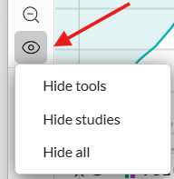
You may also use the Show/Hide icon docked at the bottom of the toolbar at the left of the chart to show/hide all studies or all tools on the chart.
Adding & Deleting Indicators
You may add an unlimited number of indicators or studies to an Interactive Chart.
Click the Indicators control to view available studies. The keyboard shortcut "/" (Slash) also opens the Indicator dialog. You may also use this control to change or remove studies that have already been applied to the chart.
Once a study is on the chart, you can click on the study header, or open the Indicators control and click on the study to change the study parameters, including the color and thickness of the study plot. You may also identify the pane in which the study should be added (on the main chart or in a new pane).
Once a study is on the chart, you can remove it by opening the Studies menu and clicking the Delete "X" icon next to the study name. You may also delete a study by clicking the X that appears next to the study name shown on the chart or by opening the study parameters and clicking Delete.
Notes: When logged in, Barchart remembers the settings you last used on each study. For example, if you add a Simple Moving Average, change the period to 50 and change the color to red, the next time you add a le Moving Average it will default to the same settings.
If you wish to add Fundamental data to a U.S. or Canadian equity, you will need to add these via the Chart Templates page. Fundamentals can be plotted as either quarterly or annual data.
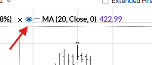
Hiding an Indicator
Once you apply an indicator on a chart, you may temporarily hide it using the "eyeball" icon.
You may also use the Show/Hide icon docked at the bottom of the toolbar at the left of the chart to show/hide all studies or all tools on the chart.
Cloning Studies
Once a study is on your chart, you can quickly clone it (make an exact duplicate), then modify the clone's parameters. This is helpful if you want to quickly add a number of Moving Averages to your chart, using different period parameters and colors for each.
- Add a study to the chart.
- Click the Indicators control, then click on the study as if you were going to Edit it.
- Using the Actions menu in the bottom left, select one of the CLONE options. Once cloned, you may edit that study and can adjust the parameters, colors, plot thickness.
Adding Trend Lines, Annotations and Other Tools
Interactive Charts docks a Drawing Tools Panel to the left side of the chart, making it easier for you to access and add chart annotations.
To show or hide the panel, use the double arrow toggle at the bottom of the Tools Panel. When logged into your account, we will remember the last-used tool in each group, and whether or not you've closed the Tools Panel.
Tools are grouped into six categories: Lines, Fibonacci/Fan /Pitchfork, Shapes/Text, Symbols, Numbers, and Calculations.
There is also a Show/Hide icon docked at the bottom of the toolbar that allows you to show or hide all studies or all tools on the chart.
Once you select a tool, click on the chart to start its placement. (For mobile devices, add the tool by placing your finger on your device and drag to draw.) Any tools or annotations you add are always saved (if you are logged in) and will show the next time you view the chart.
To change the color or parameters of a tool, right-click on the tool after its been placed on the chart. (For mobile devices, double-tap on the tool to open its parameters.)
To delete a tool or trend line, click on the tool to select it, then press your delete key. Or, right-click on the tool to open the parameters:
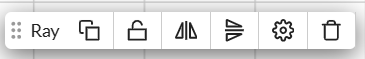
Then, select trash can (DELETE) icon. (For mobile devices, double-tap on the tool to open its parameters, then select DELETE.)
To add an exact copy of an existing tool, right-click on the tool after its been placed on the chart. Click the "Duplicate Annotation" icon. Once the tool is cloned, you can edit its color, parameters, or move it to a different area on the chart.
Note: When logged in, Barchart remembers the settings you last used on each tool. For example, if you add a trend-line and change the color to a red dotted line, the next time you add a trend-line it will default to a red dotted line unless changed again or Reset.
Reordering Panes
Studies, Fundamentals, and Expressions are either added as an "Overlay" (the study is plotted in the main chart window over the underlying chart's price data) or as an "Indicator" (study is added as a new pane at the bottom of the chart).
When a chart has 2 or more panes, you can change their order by clicking the up/down arrows (found at the top right corner of each pane).
Resizing Panes
When a new pane is initially added to a chart, it is added at a set height. To change the size of a pane (making it either taller or shorter), position your mouse cursor on the horizontal border at the top or bottom of the pane. Then drag and drop the horizontal border to your desired height and release your mouse.
Expressions
You can plot an expression or common futures spread by clicking on the "f(x)" button at the top of the chart.
The Expressions dialog allows you to choose from a number of popular commodity spreads. When you select a popular spread from the drop-down list, the expression is built automatically for you. You may also create your own custom spread chart by entering the mathematical calculation.
The calculated results are displayed using the bar type you choose for the expression. Additionally, an expression can be added to the main chart window, or as a new pane on the chart (you'll choose the placement when you create the expression).
If you want to create your own custom expression, you can enter the calculation directly into the expression field. Expressions consist of:
- symbols - must be enclosed in "curly brackets". Examples: {ZC*1} {ESU7} {IBM} {^EURUSD}
- constants: any floating point number like 2.35; note that we don't support "scientific" notation (for example 1.72E5)
- operators:
- unary operator - (negation) so you may enter -2 + 1 and are not forced to type 1 - 2
- binary operators:
+ (addition)
- (subtraction)
* (multiplication)
/ (division)
^ (power)
These are listed in order from lowest to highest precedence (multiplication and division will always happen before addition and subtraction, unless grouped by parentheses).
- to make sure precedence is correct, parentheses ( and ) can be used; for example 2 ^ 2 + 3 = 7 but 2 ^ (2 + 3) = 32
- comments may be appended to the expression by using "//" before your comment.
An example, showcasing all variables:
{ESM25} * 4.75 - (-(1.5 + {ES*2} / 33) ^ 2 * 4.25) // emini expression
If there is an error in your expression, it will be noted in red text. You must correct any errors before you can save the expression to your chart.
To invert the scale for a symbol, enter an expression with a zero preceding the symbol: 0-{SPY} or 0-{IBM}
Note for Futures Contracts: Barchart's charting application commonly uses the * symbol on futures contracts as a shortcut to specify the month. For example, ZC*1 will return the front month, ZC*2 returns the second month out, ZC*3 returns the third month out, etc. Using shortcut symbols when building an expression is allowable:
({ZC*1} + {ZC*2} + {ZC*3}) / 3 will add the front, second and third months for Corn, then divide the result by three.
Comparison Chart
You can add other symbols for price comparison directly on the chart. To create a Comparison chart, click the "Compare" icon.
We provide a list of major market indices that you can select for comparison, or add your own symbols.
Each comparison symbol uses its own color and bar type, chosen when you create the Comparison chart.
You may also specify where to place the comparison symbol: in the Main Pane (with the chart's symbol), in a New Pane, or on the "Left Scale." When a symbol's price scale differs from the underlying chart, you may want to select the "Left Scale" option so the price data can be displayed in an easier-to-read format.
Comparison charts can also be compared using "Actual Values", "Net Change", or "Percent Change". A Percent Change chart showing the percent difference between the comparison symbols and the underlying symbol on the chart.
Saving a Template with Comparison Symbols
When you create a chart with comparison symbols, you may save this to a Chart Template to use again.
Note: When saving the template, you must check the box "Include compare symbols" or they will not be saved to the template.
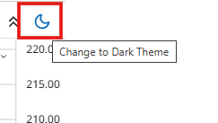
Changing to "Dark Theme"
Interactive Charts can be configured to use a dark background / dark theme. Click on the moon/sun icon at the top right corner of the chart to toggle between light and dark theme.
You may also set your entire Barchart account to use either a light or dark theme in your Site Preferences.
Zooming and Panning the Chart
Chart panning is used to drag the data shown on the chart backwards and forwards in time. Chart panning is used when you want to see older data than what is initially shown on the chart. To pan the chart, position your cursor on the main chart pane and drag and drop the data to the left or the right. To reset a chart that's been panned, look for the double arrows at the very bottom right portion of the chart. Clicking these arrows will return the chart to the initial setting.
Chart zooming allows you to enlarge a section of the chart. Use the "+ magnifier" icon in the toolbar docked to the left of the chart, then drag and drop on the area you wish to expand. To return the chart back to its initial setting, click the "- magnifier" icon in the toolbar.
Grid Charts
Barchart Plus and Barchart Premier Members have an additional way to view multiple charts at once in the chart panel.
Using the "1x1" icon, you can select to view from 2 to 6 different charts at once.
SYNC Settings tell the chart panel whether you are loading one symbol into all frames (Grid Charts) or different symbols in each frame (Multi-Charts).
- Symbol Sync ON: load one symbol into all frames (Grid Charts)
- Symbol Sync OFF: select any frame to make it the "active frame" (indicated with a blue outline) then either type the symbol you want to view, or click on a symbol from any of your controllers.
Other Sync settings include the options for Interval, Indicator, Bar Type, and Template. With one of those settings checked (ON), changes apply to all charts in all frames.
Use your Tab or Shift+Tab keys to navigate between the grids. To return back to a single chart mode, change the grid back to 1x1.
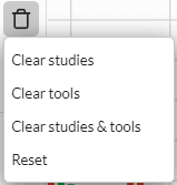
Clear
There are two ways to clear the chart of studies and annotations.
- Look for the "Actions" menu at the top right of the chart. Select "Reset" to completely clear the chart of all studies and annotations. This returns the chart to the "Site Default" setting (6 Month Daily OHLC chart with Volume.)
- Look for the "Trash" icon in the toolbar, docked to the left side of the chart. Clicking on this icon, you have the choice to clear all studies, clear all tools, or clear BOTH studies and tools (this returns the chart to the "Site Default" setting.)
Pop-out Icon
The Pop-out icon opens the chart in a new browser window. You can pop out as many charts as you wish, and continue to use the Barchart.com website in a different browser window. Once in pop-out mode, you can change to a dark theme chart by clicking the "Mode" button in the upper right corner of the chart. Changes made to a pop-out chart are saved, depending on your Chart Saving Preference.
Additional Chart Controls
At the top right of the chart, you will find additional icons that you can use to control more data on the chart. These include:
- Notes: Use this to add High / Low flags or symbol notes. Flags are used to alert you that the symbol's Last price has gone above or below the values you set. When Last is greater than the High Flag, the symbol is underlined in green. When the Last is less than the Low Flag, the symbol is underlined in red. Notes are used to add your own commentary about the symbol. Notes and High / Low flags are displayed all through the website wherever the symbol is found (such as in your watchlists, portfolios, and Barchart pages.)
- + My Charts: Use this to add a copy of the chart to My Charts.
- Alerts: Use this button to add a price, news, or advanced alert based on technicals and other data.
- Watch: Use this button to add or remove the symbol to any of your watchlists.
- Actions: This menu contains additional actions available on the chart.
- More Data - opens a widget that contains additional quote, performance, news, opinion, and other technical data. View key statistics about the symbol without leaving the chart page.
- Add to My Charts - Use this to add a copy of the chart to My Charts.
- Share Chart - Share Chart (via social media, email, or copy a link to the clipboard)
- Download Chart Data - Download Chart Data to a CSV file, including all studies on the chart
- Print Chart - sends a copy of the chart to your printer
- Save Chart as Image - saves a .PNG file
- Reset - this completely clears the chart of all studies and annotations. It returns the chart to the "Site Default" setting (6 Month Daily OHLC chart with Volume.)
Right-Click Menu
Many of the actions you can apply to a chart are also accessible when you right-click on the chart. Actions include:
- Add Indicator
- Add Drawing Tool
- Change Plot Type (bars, candles, area, etc.)
- Change Interval (minute, hourly, daily, weekly, monthly, etc.)
- Change Range (1-day, 1-month, 6-months, 1-year, etc.)
- Display Options including:
- adding Events, Dividends, Splits, Contract Roll Settings and Back-Adjust Settings for futures contracts
- Grid Lines
- Crosshair
- Tooltip
- Share and Print Options including:
- Share Chart (via social media, email, or copy a link to the clipboard)
- Print Chart
- Save Chart as Image
- Download Chart Data to a CSV file, including all studies on the chart
- Apply a Template
- Open Templates Dialog
- Open Chart Settings
